Freelance Work
Brand Identity Design for GoFarm
Designing a friendly, future-ready retail brand for India’s next fruit & vegetable franchise.
A Fruits and Vegitable store in Gurugram, Haryana, India. They are planning to build a franchise business model by standardizing the store design and workflow.
Project overview
GoFarm is a fruit and vegetable retail brand based in Gurugram, Haryana, with a vision to scale into a standardized franchise model across cities.
The goal was to design a strong, friendly, and system-ready brand identity that:
 Builds trust with everyday customersFeels fresh, hygienic, and accessibleWorks consistently across physical stores, packaging, uniforms, and digital touchpointsScales seamlessly into a franchise business
My role
- Brand Identity Designer
Scope
- Logo Design
- Color System
- Visual Language
- Store Branding Direction
Industry
- Fresh Produce
- Retail
- Franchise
Industry
- India (Tier 1 & Tier 2 expansion ready)
The challenge
The Indian fruit & vegetable retail space is:
- Highly unorganized
- Visually inconsistent
- Lacking strong brand recall
- Dependent on trust
- Dependent on perceived freshness
GoFarm needed: a recognizable identity, a modern yet approachable tone, a system that franchise owners could easily adopt, visuals that communicate freshness, honesty, and speed
This wasn’t just about designing a logo — it was about designing a repeatable retail system.
Logo concept & meaning
The “G” in GoFarm is the heart of the identity.
Key Symbolism:
The lower cut of the letter “G” forms a smiling mouth
The inner arrow points forward and toward the farm
Represents:
Freshness with a smile
Direct-from-farm movement
Fast, honest supply chain
Positive everyday shopping experience
This subtle storytelling makes the logo:
Emotionally warm
Functionally symbolic
Instantly memorable
It communicates “Happy produce that moves straight from farm to family.”
Brand color system & psychology

Two primary colors together create: A perfect balance of vibrancy + credibility
Primary colors
Orange (#FE7E0F) - Energy, warmth, appetite and high visibility on storefronts
Green (#87C830) - Freshness, nature, trust, and farm-to-table association
Secondary colors
Cream Peach (#FFE2CC) - Soft background tone, friendly packaging and in-store surfaces
Mint Light Green (#E8FFC0) - Clean, hygienic feel, Perfect for UI, posters, and price labels
Deep Brown (#190C02) - Earthy contrast tone, Used for text, signage, and premium accents
Franchise-first design
The identity was built to be:
- Paint-friendly for storefronts
- Low-cost reproducible for franchise owners
- Highly visible from distance
.jpeg)
Easy to apply across:
- Store boards
- Awning
- Staff uniforms
- Crates & boxes
- Packaging
- Delivery bags
- Digital banners
- Social media
Every element follows: -High contrast · Clean shapes · Friendly geometry · Fast recognition
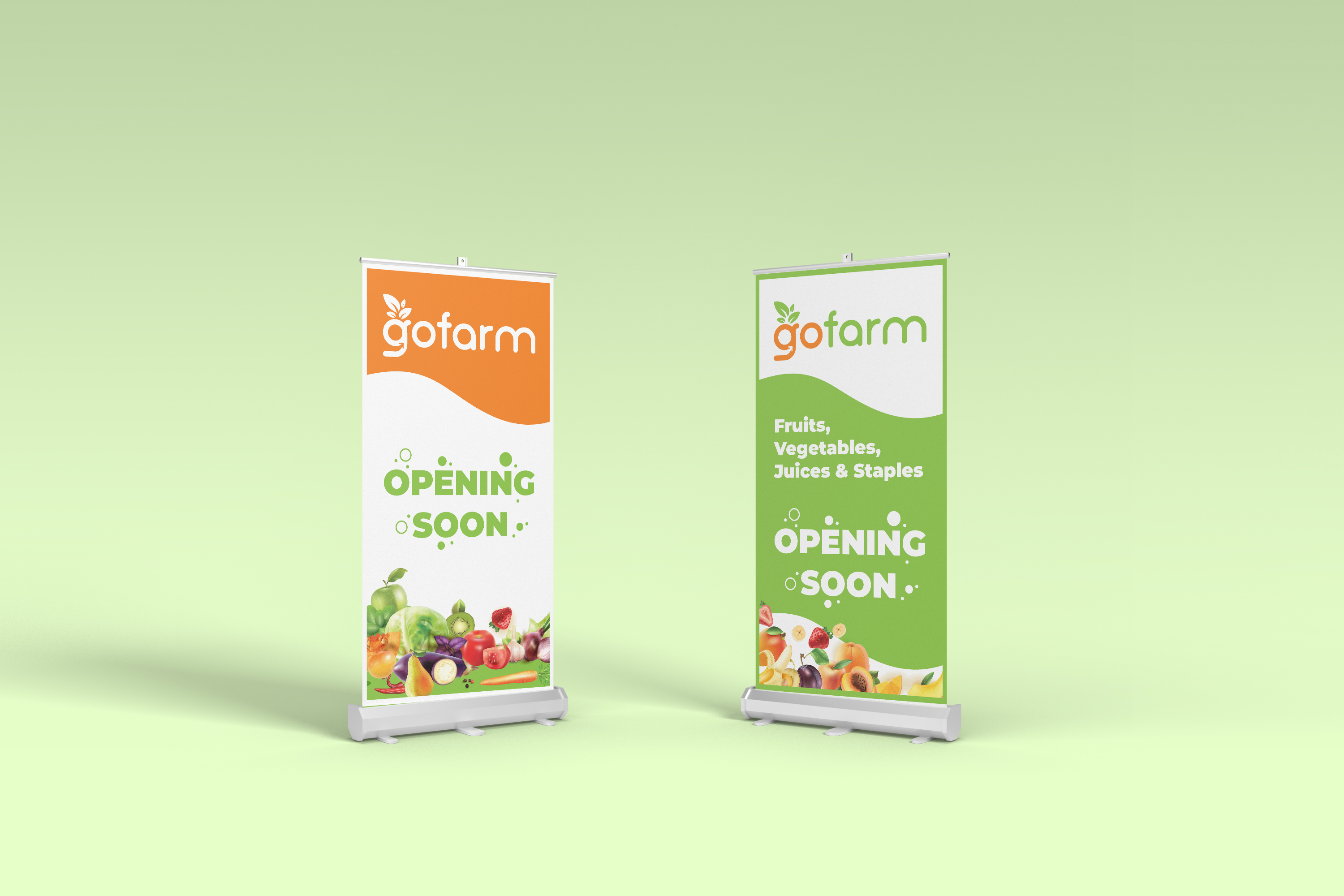
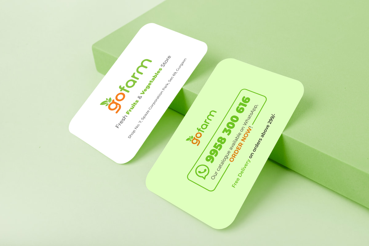
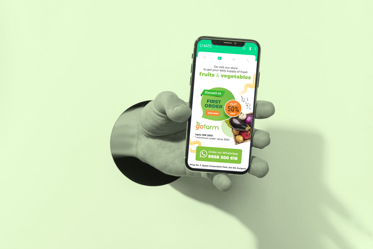
Mockup Designs